He discusses getting Ali to pose for the Esquire Magazine cover
… ALI! my vote for ‘man of the 20th century’. i don’t think you can make a list of true heroes of mind and conscience and just plain LIFE without putting him near the top. we all owe him so much. thank you, mr. ali.
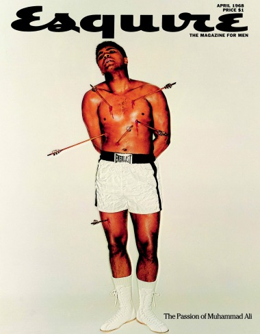
this cover is probably (also) one of the truly greatest magazine covers of the last century. this was designed by george lois, also one of the greatest conceptual designers of any era. this magazine cover was one of those rare convergences of talents and skills and cultural POWER that came together at the perfect moment to produce an image that is forever locked into our collective experience. even those of you born in the last 20 years (and have even HALF a brain) can recognize just how perfect this magazine cover is.
i once had the rare chance to sit in a small room and listen to george lois talk about his career. he was a very tall, well built (even handsome) older man (and i mean MAN). i mean to say, he was what you might call a jock – one of those really intellectual jock types. he dominated the room when he stood up at the front. there was nothing effeminate about this guy. well, except his slight lisp. the guy had a lisp and managed to build his life by simply ignoring it.
some of his creations were the ‘i want my MTV’ campaign, campaigns for jiffy lube, espn, tommy hilfiger, and usatoday. he got guys like warren magnusen and jacob javits elected into office. george lois was the guy who championed the ‘big idea’ and ushered it into our pop vocabulary.
you see, george lois was an ‘ad guy’. sure, he was one of the greatest copywriters and graphic designers/art directors of the last century. but, he never referred to himself as anything other than an ‘ad guy’. considering how most people view the advertising industry, that’s a brave move on his part. in return, the managed to give so much intelligence and depth and wisdom to the advertising practice that he transcended the form and made a sort of popular art on par with the greatest visual artists of his era. indeed, he’s maybe the only “ad guy” to be given a retrospective exhibit at the museum of modern art.
when george lois was asked by his buddy, esquire editor harold hayes, to take on an effort to save esquire magazine’s sales, lois, who had been already thinking about the problem, said, “let me do your covers. here’s the deal, i’ll do them for as long as you want, so long as you let me do whatever i want.” (i think it was for free, too.) hayes, who respected and trusted lois, agreed on the spot. so, george lois began that amazingly great campaign of esquire magazine covers – generally considered the GREATEST series of magazine covers ever concocted, but also one of the benchmarks of 20th century art direction and graphic design. go look. they can’t be matched. all idea – no bullshit copy. either the image told you everything you needed to know, or that’s that. because NOBODY EVER READS ALL THAT CRAPPY TYPE SMEARED ALL OVER THE COVER. (note: editors! please read that again and remember…)
when lois and ali were teamed up to do a cover story on the champ’s career and political trouble in the late 60′s, it was like one of the greatest match-ups bills in the history of publishing, design AND boxing – “the fire at esquire!?” george lois and muhammad ali already knew each other. lois used to hang out with sports figures and play pick-up ball with guys alike lew alcindor (kareem abdul-jabbar) and wilt chamberlain. george lois and ali were actually ‘buddies from the gym.’ so, this was a breeze.
the resulting cover, part perfect defiant photo and part collage/photo-airbrush, speaks for itself. don’t get no betta. listening to lois talk about these esquire days is hilarious. every cover is a rich story of mayhem and inspiration. often times the images would come to him as he worked. a simple accident on the set could result in the
t cover design. however, this parody of the famous mantegna painting of st. sebastian was planned, executed and not even discussed. all george lois did was say ‘we’re doing st. sebastian. everybody heard that and just did it. perfect.
a lot of these esquire covers created a big stir when they were presented to the editor. i seem to remember that hayes balked at publishing this cover, thinking it too sympathetic to the controversial ali at this point in his career (this is when he embraced islam and refused participation in the military draft of vietnam on conscientious objector grounds. his world championship title was stripped away and the majority in the US wanted to see him in jail for treason.) so, the editor was filled with trepidation when he saw this image. but george lois reminded him of his agreement – ‘total freedom, no questions.” and hayes published it. the result was controversy, but also acclaim. and now, it’s one of the most respected magazine covers ever published.
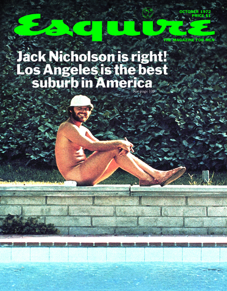
eventually, hayes finally objected to a cover he felt he just couldn’t publish. it hi-lighted a cover story about the young hip hollywood, focussing on the crowd jack nicholson hung with. the cover image was a naked (not a ‘nude’) jack nicholson smoking a joint. when hayes fought lois on that cover, george lois drew his ace card and quit. esquire (i seem to remember) published that cover, anyway in an effort to win george lois back, but nobody cared (not the public and not george lois). he was a man of his word and never went back. he and hayes are still great pals to this day. george lois just moved onto the next project – i think it was the campaign to save the NBA or something.Your final ESQUIRE cover featured a naked Jack Nicholson. It didn’t run because his agent wouldn’t allow it. Have we handed over too much control to celebrities?
A lot of my covers were brutally critical, others made people look great, but a celebrity should not dictate the cover image. It’s absurd to create an image to please a celebrity — you want to please your readers. If I was doing covers today, I’d still be doing great covers with celebrities. I had Sonny Liston pose as Santa Claus, I had Ali pose as St Sebastian, I got Roy Cohn [the leading attorney who prosecuted Senator Joseph McCarthy’s communist witch hunt), the piece of shit that he was, posing with a halo. Terrible man, and when he was walking out the studio, he said: ‘I guess you Commie sons of bitches are going to use the ugliest one.’ And I said: ‘You bet your ass, I hate you.’
But the point is, you can creatively do great covers with celebrities, sometimes with their permission, and they’ll go for it, or without their goddamn permission, and do covers that really show the drama and the power of the magazine.
What every magazine has done is play the game, pick the flavour of the month, put about 12 blurbs around him and sell the magazine. That’s the wrong way to sell a magazine. What I did was design a package for ESQUIRE each month, and you might hate it, you might love it, but you’re knocked on your ass, and you say: ‘I gotta buy this magazine.’
You said recently that if you were a young guy today, you’d make a magazine. Why?
If I had the backing to do it, I’d love that — and not have to listen to anyone or anything else. Not listen to the ad sales guys, not listen to anybody saying: ‘George be careful.’
Bull. Shit. I’d do a magazine that would knock you on the goddamn ass, and millions of people would come to it because they wanted that magazine. It would find its own market somehow. I have two or three magazines in my head for the last ten years I’d love to do. When things happen, I say: ‘Wow, what an article that would have been.’
The secret of making a great magazine is not to create it for your advertisers or your readers. You create magazines for yourself, you and your entire editorial design culture should create a magazine that you love, that you think is important. With no inane marketing research, no dumb reader studies, no nothing, just a magazine that you know is sharp and written for intelligent people like yourself. A magazine that the masses will find a thrilling experience each issue.
What magazines do you read today?
I read every word of THE NEW YORKER and VANITY FAIR, and I’m a lefty, so I read every word of THE NATION. But I look at every magazine. I buy dozens of them, look through them and throw them away. I’ll buy ten magazines, give the guy a hundred bucks, bring them home, go through them so fast you can hardly see my hand move, then I’ll leave them for my wife, maybe she’ll keep two or three, and throw the rest of them away. I just want to see what’s going on.
People ask, will magazines ever be dead? The difference between reading a magazine in your hands or on a computer is the whole visceral feel of having a magazine in your hands. If you put it on your knees, it’s a lap dance. It’s better than a woman’s ass sometimes. It’s the visceral fun of looking, being surprised, even by a good ad, by great editorial design. That’s the opportunity. Read More:http://gymclassmagazine.tumblr.com/post/10211810942/george-lois
Related Posts


(http://madamepickwickartblog.com/2012/01/but-youre-knocked-on-your-ass/)

ded by SPDuploads on Mar 12, 2008
George Lois, legendary art director, on his covers for Esquire magazine in the '60s.
This short film was created on the occasion of George Lois being awarded SPD's Herb Lubalin Lifetime Achievement Award on May 7, 2004. Named after one of the great art directors of all time, the Herb Lubalin Lifetime Achievement Award has been conferred by the Society on a very prestigious group of design legends. Other recipients include Ruth Ansel, Cipe Pineles Burtin, Milton Glaser, Will Hopkins, Leo Lionni, Art Paul, Lou Silverstein, Bradbury Thompson, Rochelle Udell, Henry Wolf and Frank Zachary. These innovative and creative practitioners of their craft remade the role of the designer and changed forever the way we envision and read a magazine.
George Lois, the designer of the most memorable and controversial magazine covers of the 60's, collaborated with the famed editor Harold Hayes of Esquire to produce an array of intellectually stimulating and creatively brilliant covers, all concepts of a world in flux.
Video created by Fred Woodward, Michael Norseng, Hudd Bayard and the talented team at GQ.
No comments:
Post a Comment